How we designed sound in a productivity app like Craft
At Craft, we’ve always strived to strike the right balance between a tool that's empowering and delightful — as we say: “form and function must come hand-in-hand”. In this post we take a look at the process around the latest delightful dimension we've added to Craft — sound design.


The beginning
Last fall, a small group of us started working on a passion project for Craft during the holiday season. Since we use the product daily for our own work we wanted to see if we could make our daily interactions with Craft a bit more delightful and do unlock a new level of intimacy between our product and the people who use it.
So we embarked on an small exploration of how it would feel to use Craft if we added the dimension of sound design and advanced haptics into the our apps. While doing some research we quickly discovered that if we wanted to do this well and the goal was to ultimately ship the feature at least internally, it was worth trying to find someone experienced and professional to guide us through the process.
Find an expert
Through a mutual friend we were introduced to sound designer Thomas Willams. You might have heard his work in award winning mobile games like Ordia, Assemble with Care and productivity apps from !NotBoring.
Thomas was a perfect fit for the project and someone who could guide us through the maze of figuring out how to go about sound in the product. Designing sound on our own could have been an option too, but we felt like part of the idea around this passion project was also getting a chance to learn how the process of creating sound work and so we thought it was worth an investment for us.
Think where sound fits in
Thomas started by exploring a few audio directions with our design team. We paid a lot of attention to how the sounds made us feel and picked the ones we liked. One of the early challenges that we faced was figuring out where sound should be placed in the product — which actions felt like they could be enhanced with sound and where the sound was excessive or made things feel unnatural.
The conversation about which sounds stayed in or out continued throughout the project. After a few weeks we got to a first set of sounds for the main actions that we thought was appropriate to begin implementation and refinement on. Since we were all really busy working on the January Craft Reloaded release we only got a chance to implement the work between the winter holidays.
Find the real why
When we heard the sounds in the apps for the first time, it was both “wow, sound in Craft is cool” but also “um, all of these sounds sort of don’t work together and some feel off”.
Most of the feedback and our feelings for certain sounds changed completely when we started to use them in the product. Sounds that felt good on a concept level needed to be simplified. Places that we felt really needed sound ended up being too intrusive and overly repetitive. But above all we just didn’t feel like we had a cohesive story and a unifying theme for the soundtrack of Craft.
Honestly, the overarching feeling halfway through the project was that we missed the mark with sound on our initial attempt and we probably wouldn't even try to ship it internally. We decided to go back to where we started and came back to a question that we started with earlier In the project:
Can we connect the joy of "crafting" something in a digital product with the same satisfaction that we sometimes feel when crafting things in the real world with real thing?
Focus on the main theme We landed on a theme around trying to bridge the gap between "crafting" things in the product and how people "craft" in the real world with real tools.
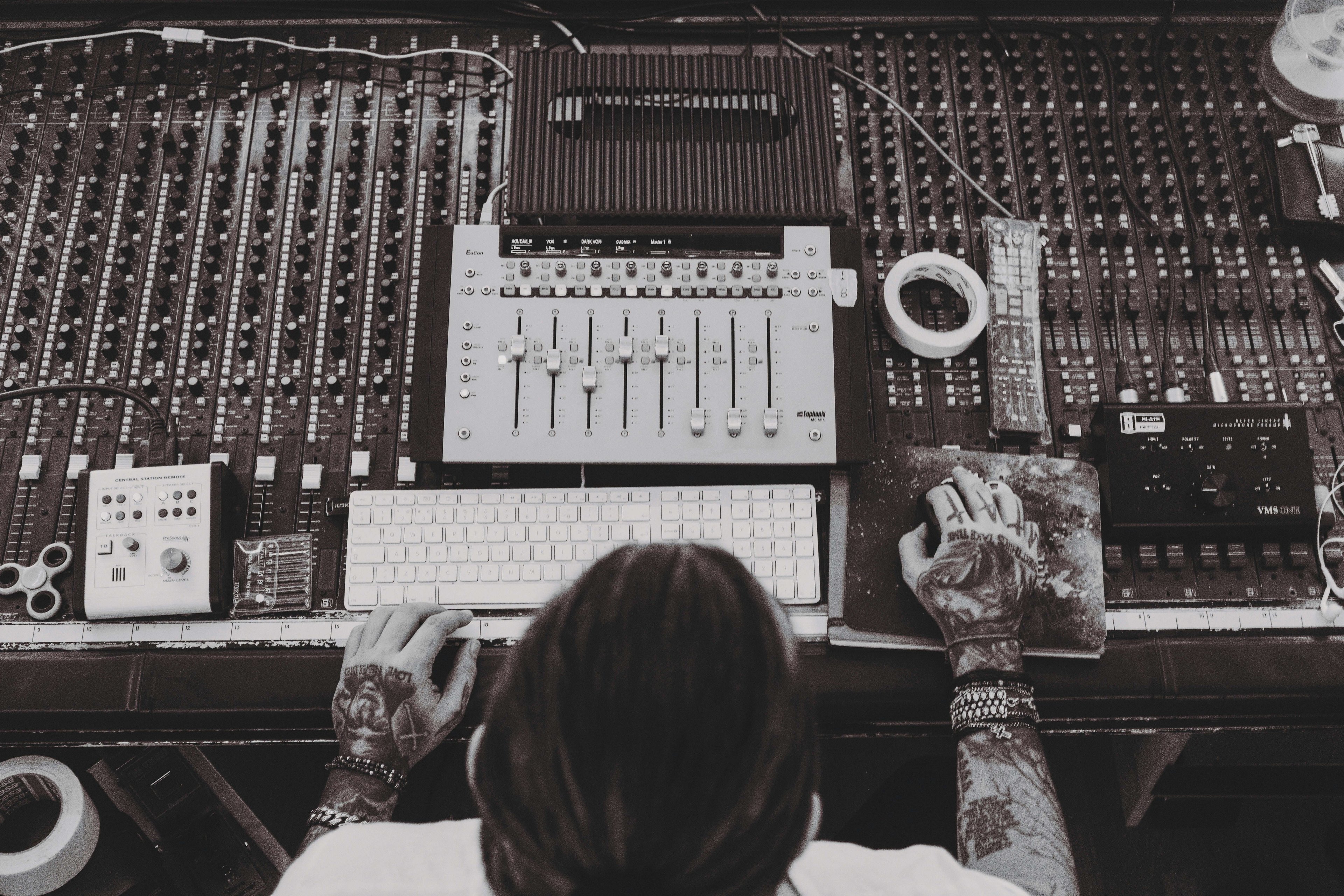
At this point, Thomas stepped in and suggested that we use sounds from real DIY that people use and hear daily (Rulers, pencils, pens, erasers, scissors, shuffled paper, and more) and pair them metaphorically with similar actions in the app.
For places where the product clearly does something machine like, for example, activating focus mode, opening, and using our AI assistant, Thomas opted for more digital or synthetic sounds.
Timing is key
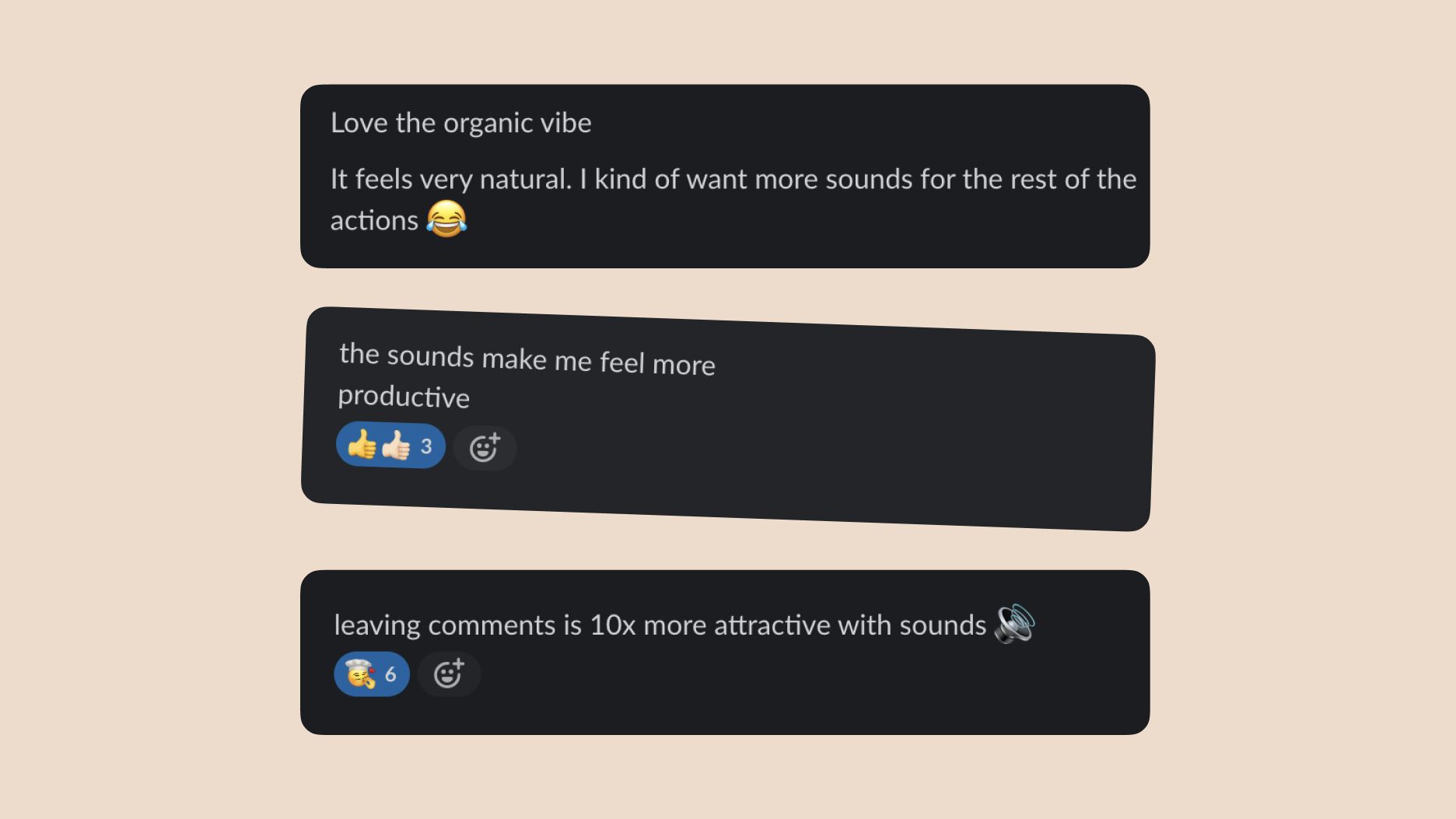
We added the updated sound into the product right as everyone came in from vacation and didn’t really say too much about it. Then we started to see messages like this pop-up on slack:

Once we started to get the input we decided to see if we could turn our little hobby project into something all of our users could enjoy. We managed to get a bit more time to refine some of the sounds and haptics and even asked Thomas to record an internal video in our demo session to talk about the process we went on to create the sounds and how they were made. Here’s that video:
Implement, refine and understand it’s not for everyone
By this point everyone was bought in to get this feature into user's hands. We knew at this stage that there would be those who wouldn’t want to use this feature at all so we added a setting to allow users to turn sounds and haptics off and also added a few more smaller touches and more sounds based on the feedback that we got internally.
For those of you who want to fast track the journey of discovering the sounds, check out the little spoiler video below capturing the main sounds. If you have any more places where you want to hear sound or get haptics please reach out to us.
Happy listening.
Artom, from the Design Team.
Supported by (Christoph, Peter, Wojtek, Kristof, and Daniela)